By Freeman Smith
Some of the most sophisticated homes in New Jersey are designed with an awareness that goes far beyond mere aesthetics; they are built to influence how you feel the moment you cross the threshold. We often focus on the structural integrity of a property. Still, I recognize that the visual frequency of your walls is what truly dictates the daily emotional experience of the space.
Key Takeaways
-
Use warm neutrals to create an immediate sense of safety and luxury.
-
Master the use of nature-inspired greens to reduce stress and promote healing.
-
Implement strategic cool tones to expand small spaces and induce tranquility.
-
Apply high-contrast accents to stimulate conversation and creative energy in social zones.
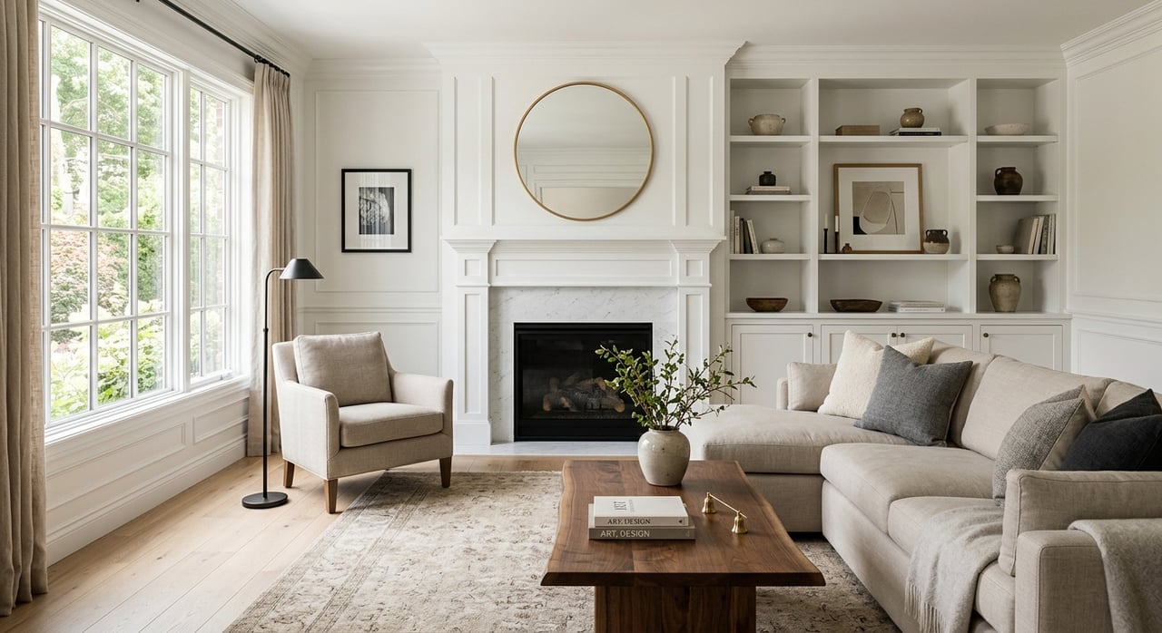
The Foundation of Feeling: Warm Neutrals and Earthy Tones
When I walk through the luxury Colonials of Morris County, I often see the powerful impact of "Sandstone Beige" and "Mushroom" tones.
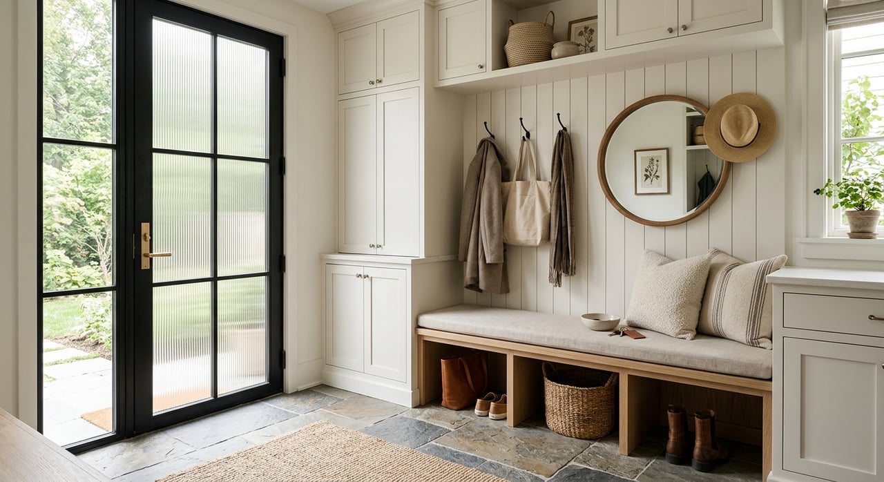
Why Earthy Neutrals Define Modern Luxury
-
Use "putty" and "taupe" tones in entryways to create a seamless transition from the outdoors, while signaling a refined and quiet luxury.
-
Pair warm neutrals with natural wood and brass hardware to ground the room in a sense of organic permanence.
-
Look for "terracotta" or "soft clay" accents in breakfast nooks to stimulate a gentle, morning appetite and a sense of optimism.
-
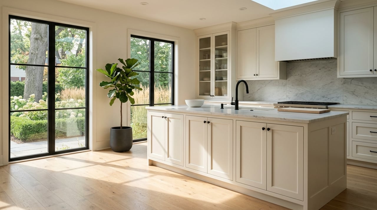
Choose "creamy off-whites" for hallways to maximize reflected light without the harsh, institutional feel of cool-toned whites.
In 2026, we are moving away from the stark, sterile grays of the previous decade toward complex, stony neutrals that play beautifully with the unique winter light we experience here in the Northeast.
The Restorative Power of Nature-Inspired Greens
I find that the most successful color psychology in home design strategies currently leverages the "Biophilic" trend, specifically through the use of heritage greens.
How Green Influences Well-Being
-
Use "olive green" in home offices to promote focus and endurance, as the brain perceives this color as a signal of growth and stability.
-
Make sure to incorporate "dusty sage" in kitchens to create a calm, organized environment that feels fresh and balanced.
-
Look for "heritage green" for built-in shelving or cabinetry to add immediate character and a sense of history to a space.
These colors act as a visual bridge to the lush New Jersey landscape, effectively lowering heart rates and fostering a restorative atmosphere that high-performance professionals crave.
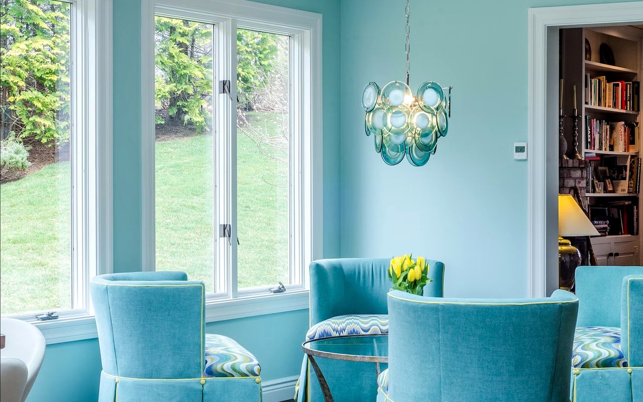
Serenity and Trust: The Strategic Use of Blues
Blue remains one of the most reliable tools in our kit for color psychology in home design, particularly for its ability to signal trust and tranquility.
Implementing Calming Blue Palettes
-
Use "sky blue" or "light aqua" in bathrooms to evoke a spa-like atmosphere that encourages self-care and hygiene.
-
Make sure to utilize "navy blue" on accent walls in bedrooms, as deep blues are proven to support better sleep cycles by lowering body temperature and heart rate.
-
Look for "midnight teal" or "blue-black" in powder rooms to add a dramatic, jewel-toned opulence that leaves a lasting impression on guests.
From the "Coastal Blue" found in beachfront estates along the Jersey Shore to the "Midnight Teal" used in sophisticated Bergen County dens, blue is a universal language for relaxation.
Stimulate Social Energy: Reds, Yellows, and Contrast
While tranquility is a top priority for most, there are zones in every home that demand a higher frequency of energy.
Activate Your Social Spaces
-
Use "mahogany" or "rich berry red" in formal dining rooms to increase appetite and encourage lively, lingering dinner conversations.
-
Look for "warm blacks" or "charcoal" in home bars to create a handsomely masculine, "speakeasy" vibe that feels intimate and private.
-
Use "color drenching"—painting the walls, trim, and even the ceiling the same saturated hue—for a dramatic, immersive escape in a library or den.
By understanding color psychology in home design, we can use these bold choices to define the "heart" of the home, where memories are made, and guests are entertained.
FAQs
Will painting my home in bold colors hurt my resale value?
In the 2026 market, "color drenching" and moody hues like navy and olive green are actually seen as sophisticated upgrades that can increase offers by thousands of dollars.
What is the best color for a windowless room or a basement?
For spaces with limited natural light, I recommend "warm whites" or "creamy taupes" that reflect artificial light without looking dingy. Avoid cool grays, which can appear "muddy" or blue in low-light settings; instead, opt for the warmth of "sandstone" to create a space that feels intentionally cozy.
How does color affect the perceived size of a room?
Lighter, cooler colors like soft blues and pale greens tend to recede, making walls feel further away and expanding the space. Conversely, deep, warm colors like mahogany or charcoal bring the walls inward, which is perfect for creating intimacy in a sprawling estate but can make a small condo feel cramped.
Reach Out to Freeman Smith Today
Reach out to me, Freeman Smith, and let's discuss how we can use the latest trends in color psychology in home design to elevate your current property or find your next masterpiece. I’m ready to provide the professional insight and the trusted local connections you need to transform your vision of luxury into a reality.
Contact me today to start your journey and discover why the most beautiful homes in New Jersey are also the ones that feel the best to live in.
Contact me today to start your journey and discover why the most beautiful homes in New Jersey are also the ones that feel the best to live in.